Project Scope
Strategy Branding Campaign Website Photography Videography
Industry
Government Council Tourism Economic
We are excited to showcase this exceptional project that began as a brand strategy to reposition Logan City Council and ultimately resulted in the creation of a dynamic new brand identity, a powerful city pride campaign and an engaging editorial style website.
Our strategy was to empower City of Logan to own their rough edges; to stand proud as a beautiful work-in-progress and take pride in being a little rock n roll. Because pretending to be something you're not was never an option, and let's face it, no one ever called them boring.
Strategy
Behind every great brand is a top-notch strategy. Map Creative provided the brand analysis, insights and actions with stakeholder engagement to create an informative 200-page document that laid the foundations for success. We presented a vision for a vibrant new city brand built with its feet grounded in reality and its eyes fixed on the horizon.
Rebrand
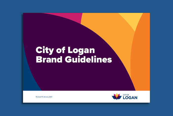
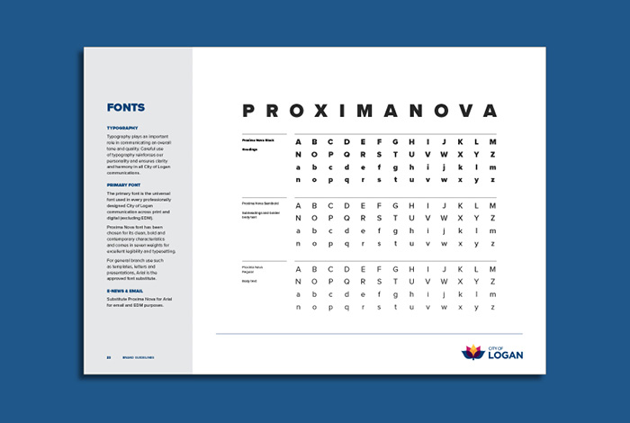
Brand guidelines provided the visual language that reflected City of Logan’s characteristics and delivered a suite of tools and rules to ensure consistency of style across all marketing channels.
View More
Logo Design
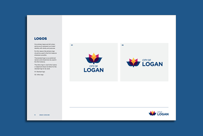
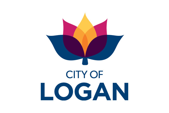
The flower logo is symbolic of growth and renewal whilst the colours represent Logan’s three pillars; economy (blue), tourism (yellow) and vibrant communities (pink). The yellow ‘flame’ leaf provides a beacon of light, much like an Olympic torch and is symbolic of hope and optimism, they overlap to represent integration and diversity.
Brand Statement
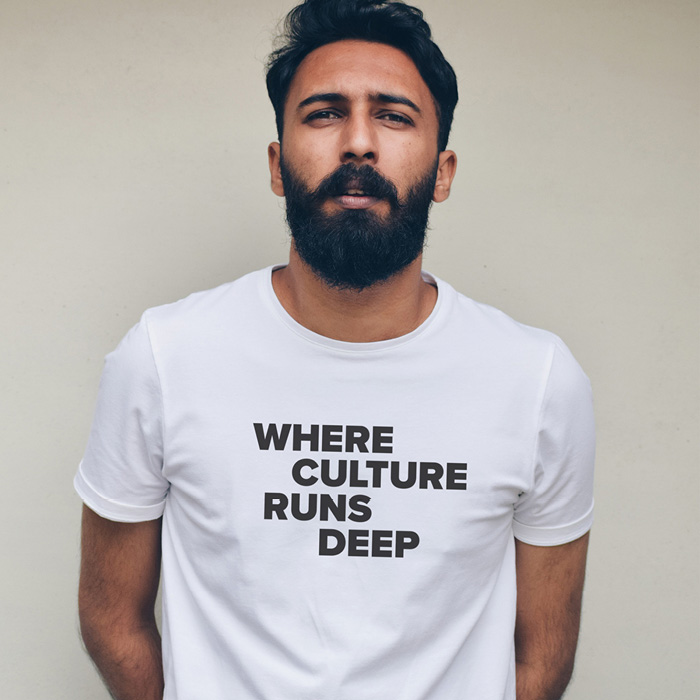
We are the City of Logan: a proud, grassroots community, filled with mavericks, makers and innovators. Here, neighbourly love is strong; environmental and business values run deep; and culture, heritage and diversity is our DNA. The City of Logan is inclusive, proud, diverse, generous and progressive. It is a place that knows itself, is proud of what it has now and what it is becoming.
“Council brands are typically conservative, but not this one! It’s a creative and colourful brand with empathy, energy, attitude and diversity at its core.”

Proud City Campaign
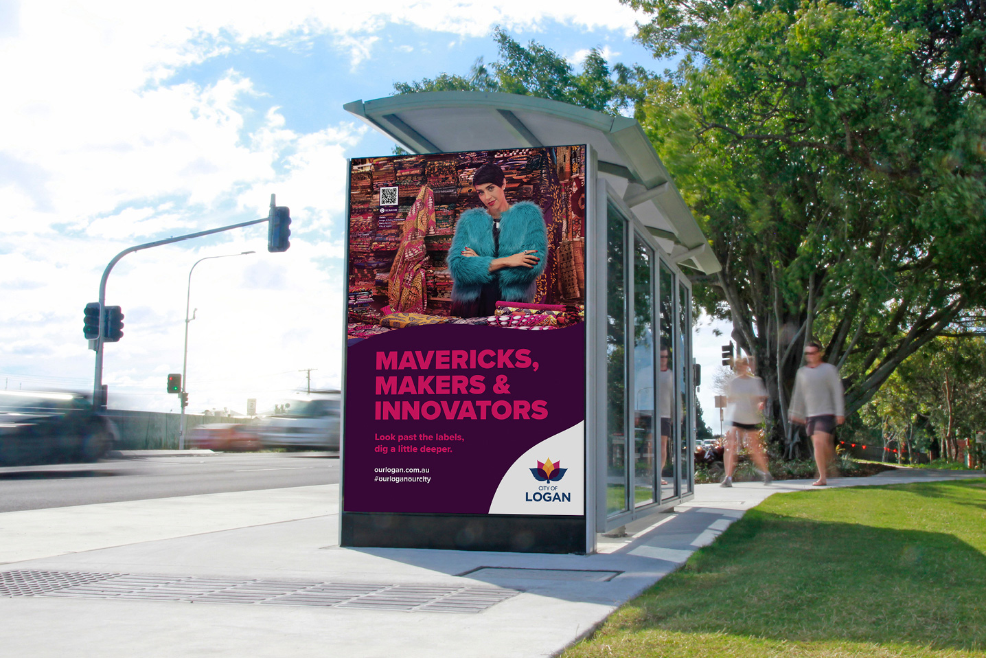
Our brief was to create a campaign that would inspire optimism within the community and collaborate with council to develop a positive narrative for the city whilst launching their new brand at the same time.
Map Creative developed the Proud City campaign to empower Logan to own their rough edges; to stand proud as a beautiful work-in-progress.
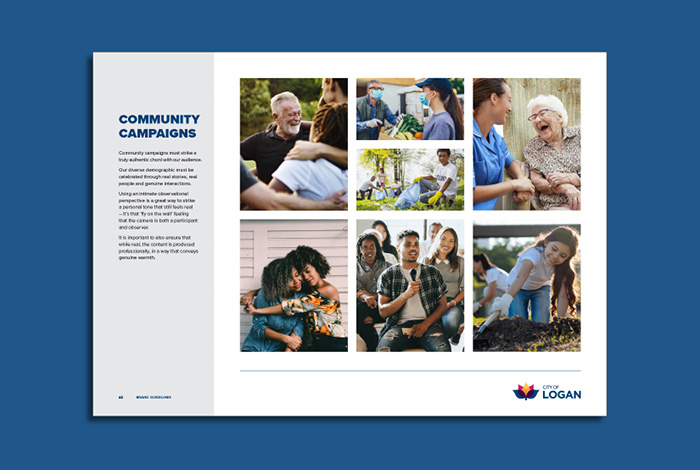
We shot video and photography of Logan’s many colourful characters and communities. From a Criminal Prosecutor turned Image Consultant to an Afghani child refugee turned women’s Soccer Coach, we listened to their stories and created content to shine a light on the incredible contributions they make.

“You can’t force authentic. You can’t fake real. It takes tenacity to know yourself in the face of judgement.”


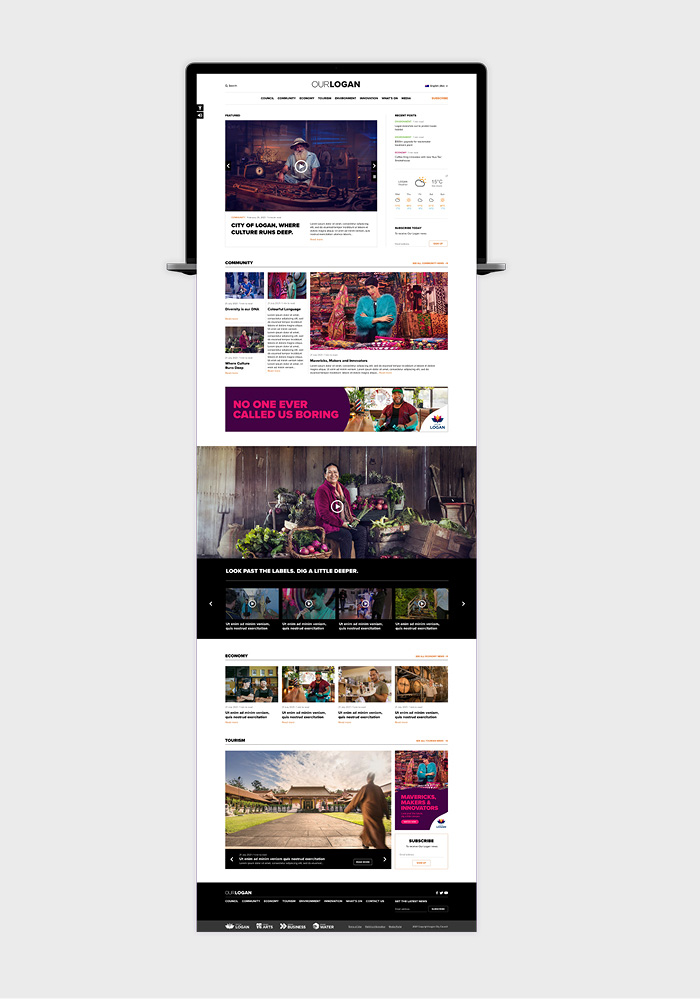
Website Design and Development
As part of the strategy to empower the City of Logan to drive a positive narrative in the media, we designed and developed the Our Logan website and media portal. As an editorial style online publication, Our Logan celebrates the city’s diversity and vibrancy by sharing the many positive stories of the people who call this city home.
“From a Criminal Prosecutor turned Image Consultant to an Afghani child refugee turned women's Soccer Coach, we captured the many positive contributions everyday locals are making. ”
